Yes, I’m on vacation, but Char sent this commentary to me and it is too good to wait. Char hit this one out of the park, IMHO. (yes there is spring-like weather in Colorado again).
Retiree networks echo Andy Stahl’s info that a letter from the Secretary is coming…
Below is an excerpt, but as usual with Char, the whole thing is definitely worth a read.
Goodbye, Pine Tree. Hello, Bland.
Just how insipid becomes clear when reading the department’s description of its so-called signature model:
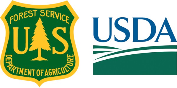
The USDA symbol is a graphic representation of the land — the foundation of all agriculture — and the Department’s initials. The symbol’s colors — dark green and dark blue — represent the essential elements of earth, air, and water. Together these elements comprise the symbol.
Now cast your eyes over the USDA logo itself — what exactly does it evoke? Where? Who? Looking more closely at this generic landscape, can you spot anything missing? If you worked for the largest agency within USDA — the Forest Service — you might well be puzzled that nothing is growing in this stylized field of green and blue. You might also crack up at the cutting remark of one agency retiree, who lambasted the USDA symbol as “the ultimate example of permanent deforestation.”
Not laughing is the upper echelon of the USDA hierarchy; after more than two years of planning, they’re taking this aggressive rebranding quite seriously. Asserting that hitherto the “USDA symbol is the official and sole identity mark for the Department and all agency programs,” Secretary Tom Vilsack and his staff have rolled out the dead-handed language of federal bureaucratese to justify their actions: “The USDA symbol will give consistent identity to the Department, increase public recognition of the value and wide range of USDA’s products and services, and bring economy of scale to the production of visual information materials.”
Given that the USDA oversees the homogenization of milk, is it any wonder that it wants to standardize it tens of thousands of employees spread out over more than 20 agencies? To make their uniforms uniform, to insist that all signage, vehicles, news releases, websites, social-media platforms, letterheads, envelops, business cards, powerpoint presentations, certificates of merit — right down to the smallest “event name cards,” and table-tent cards — conform to and are consistent with the rigorous set of departmental graphic standards.
To insure compliance, the department also has created an oversight office, whose head bears the august title of Director of Brand, Events, Exhibits, and Editorial Review Division (BEEERD). Amid the fiscal turmoil of sequestration, Secretary Vilsack & Co. appears strangely worried about appearances.
The department might instead want to think about the budget, the astonishing costs associated with repainting the Forest Service’s vast fleet alone (not to say those vehicles that carry food inspectors, researchers, librarians, natural resource scientists, and a host of others on their daily rounds). They might also calculate the lesser but still substantial price tag for reprinting stationary, reissuing IDs, and redesigning logos, uniforms, and, yes, badges.