Note: I am not criticizing any individual involved. From my first to my last questions, they were all extremely helpful to me. I hope this little story gives non-scientist a glimpse behind the curtain of the scientific paper production process.
Fortunately, the paper was published in an open access journal so we all could read it. I followed the trail to the first author and emailed her as to where she got the data for the map in question. She replied almost immediately and perhaps surprisingly, the trail went directly to a person we know, Todd Morgan at University of Montana! Small world. So I wrote him and he gave me a thoughtful answer.
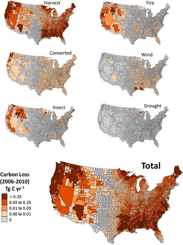
A Presentation Problem
From Todd Morgan:
“One of the reasons why the harvest carbon data look so odd has to do with how they are displayed on these maps. Nevada is prime example of this, but it applies to several other areas in the west. The viewer sees huge geographic areas (e.g., the entire state of NV) shaded with a single “carbon loss” value, whereas most of the rest of the country is shaded on a county-by-county basis. Because of the way the TPO data (and possibly other FIA data) are stored in the database, and counties are often grouped together to prevent disclosure of individual landowner information, there are county groups or whole states with a single value. The paper briefly mentions this in the section “Timber product output data (TPO 2007).
A possible way to deal with this “combined county” grouping is to take that single value and divide it among the number of counties it includes. So, in NV, the value of each county in NV would be 1/17 of the state total. Or one could contact the source of the data (like you did) and find out that the NV value for harvest is really from two small counties in western NV and the statewide value could be split between those two counties and the rest of the counties assigned a Zero value. That would help make maps that visually make more intuitive sense – i.e., the brown shaded area of NV would be very small geographically relative to the rest of the state – like can be seen in east Texas vs. west Texas.
Another solution to this would have been tabular reporting of state level values for harvest (and possibly other disturbances) would allow comparisons to other whole states. At the state level, one would see that the volumes for NV (should) make sense compared to other whole states (i.e., NV would be a very small value compared to most other states). A third way to make the maps make more visual sense would be to map Tg C per acre per year – in other words scaling the data by the acres of timberland – like was done in Figure 1 of the paper. Again, that would probably reveal amounts of carbon that “make more sense” so instead of comparing the total carbon for the State of NV to each individual county in the rest of the country, one could compare the carbon per acre in NV to the carbon per acre in other locations.”
Still, something very odd seems to have been happening in Coconino, Arizona (and neighboring counties?) during this time period.
Next post: Potential Pitfalls of Combining Datasets