There are two current tools (at least) one by CEQ and one by EPA. We’ll look at EPA’s in another post. Both of them refer to the CEJST, which is:
Federal agencies will use the CEJST for the Justice40 Initiative. It will help them identify disadvantaged communities that should benefit from the Justice40 Initiative. The Justice40 Initiative seeks to deliver 40% of the overall benefits of certain Federal investments to disadvantaged communities. These investments relate to seven areas: climate change; clean energy and energy efficiency; clean transit; affordable and sustainable housing; the remediation and reduction of legacy pollution; the development of critical clean water and wastewater infrastructure; and training and workforce development. This task of delivering the benefits of hundreds of Federal programs to disadvantaged communities is challenging. It requires fundamental and sweeping changes to the ways in which the whole Federal government operates
So that’s why it’s important to us. It will be a tool to disperse government funds, so .. should be looked at quite carefully. There are a variety of ways to do this. This one combines data sets collected for other purposes with intentions of “justice” so certainly deserves some scrutiny.
First, CEQ used First Street’s questionable Wildfire Risk Maps instead of the USG’s own. Why? We’ve critiqued those maps here.
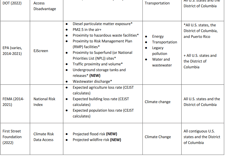
If you read their v. 1.0 technical support document, table 2 on page 18, it stands out among the other sources. If CEQ needs wildfire risk data, wouldn’t it make more sense to ask the wildfire agencies… and if it doesn’t work for CEQ for some reason… explain why and ask the agencies to analyze that? I think it’s really quite puzzling, given the extra transparency and quality that government data requires (e.g. the Data Quality Act). And taking public comment and so on.
Anyway, that was a surprise!
If you think it’s a bad idea to use their data, or have other improvements to suggest, they have a couple of places on the website to give feedback.
****************
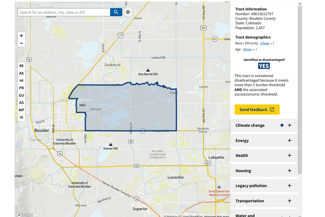
Here’s what I did.. check out some area you know. (they use census tracts so that leads to straight lines where you can imagine more of a gradient).
And then on the right side, you can check out why it is “overburdened and underserved.”
For example, I picked one next to Boulder, Colorado an area I’m familiar with.
It explains:
This tract is considered disadvantaged because it meets more than 1 burden threshold AND the associated socioeconomic threshold.
Expected building loss rate
Economic loss to building value resulting from natural hazards each year 95thabove 90th percentile
- Expected population loss rate Fatalities and injuries resulting from natural hazards each year 96thabove 90th
And
Low income People in households where income is less than or equal to twice the federal poverty level, not including students enrolled in higher ed
71st above 65th
Housing cost
Share of households making less than 80% of the area median family income and spending more than 30% of income on housing 55th not above 90th
Wastewater discharge
Modeled toxic concentrations at parts of streams within 500 meters 96thabove 90th
Also: High school education