All of the maps in this post can be clicked on to see more clearly.
This is the second in two posts about the Justice 40 Initiative and the EPA and CEQ maps. The CEQ map is called the “Climate and Economic Justice Screening Tool” while the EPA map is called the Environmental Justice Screening and Mapping Tool. That’s why I first became curious about these efforts… something like “how many agencies does it take to map screwing in a light bulb?”
For those of you concerned about government duplication and inefficiency, it appears that both maps use the same Front Street data. I’ll talk some more about that data source in another post.
I’d like to call your attention to a couple of things, though.
(1) According to the EPA map, all these topics are “climate change”. Drought, coastal flood hazard, 100 year floodplain, sea level rise (NOAA), wildfire risk, and flood risk. So it appears that risks may already have climate change already modeled into them. Fortunately for wildfire we can look at the Front Street results and find they used a reasonable 4.5 scenario. But it’s not particularly clear that all these estimates used the same one, or that they modeled climate the same way. Perhaps it doesn’t matter as EPA says
Screening tools should be used for a “screening-level” look. Screening is a useful first step in understanding or highlighting locations that may be candidates for further review. However, it is essential to remember that screening-level results:
- do not, by themselves, determine the existence or absence of environmental justice concerns in a given location
- they do not provide a risk assessment and
- have other significant limitations.
So they are saying, we mapped risks but .. they may not be accurate? It seems to me that non-ground-truthed maps can lead to a kind of bad mapping snowball, where more and more policies are based on maps which were never intended for that purpose and are.. well.. wrong for what the policy is intended to do. We have seen that before with scientific papers in which authors use others’ data inappropriately (according to the people who collected it). Mapping also can obscure the differences between measurements and models. Like is PM 2.5 measured or modeled? You have to look at the fine print to figure that out.
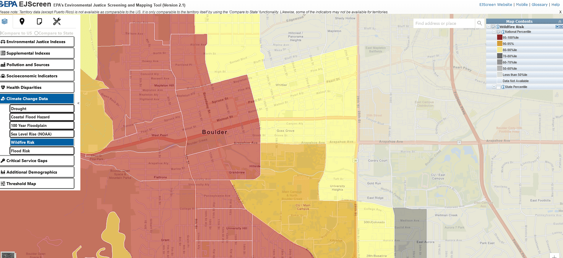
(2) But let’s go back and look at downtown Boulder. The EPA map simply says that it has a 95-100% wildfire risk in case you can’t read the numbers in the graph above. Below is the CEQ version, which explains the numbers a little better.
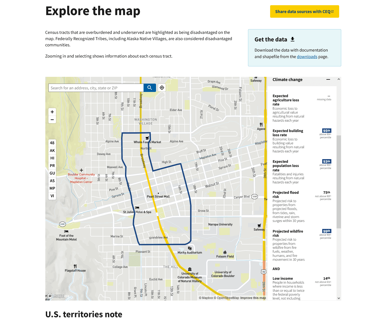 So the good news is that both agencies seem to be using the same data, and based on my sample size of one, come up with the same numbers for the same area. But let’s see what CEQ tells us that the 99 (!!!) percent number means.
Projected wildfire risk
Projected risk to properties from wildfire from fire fuels, weather, humans, and fire movement in 30 years.
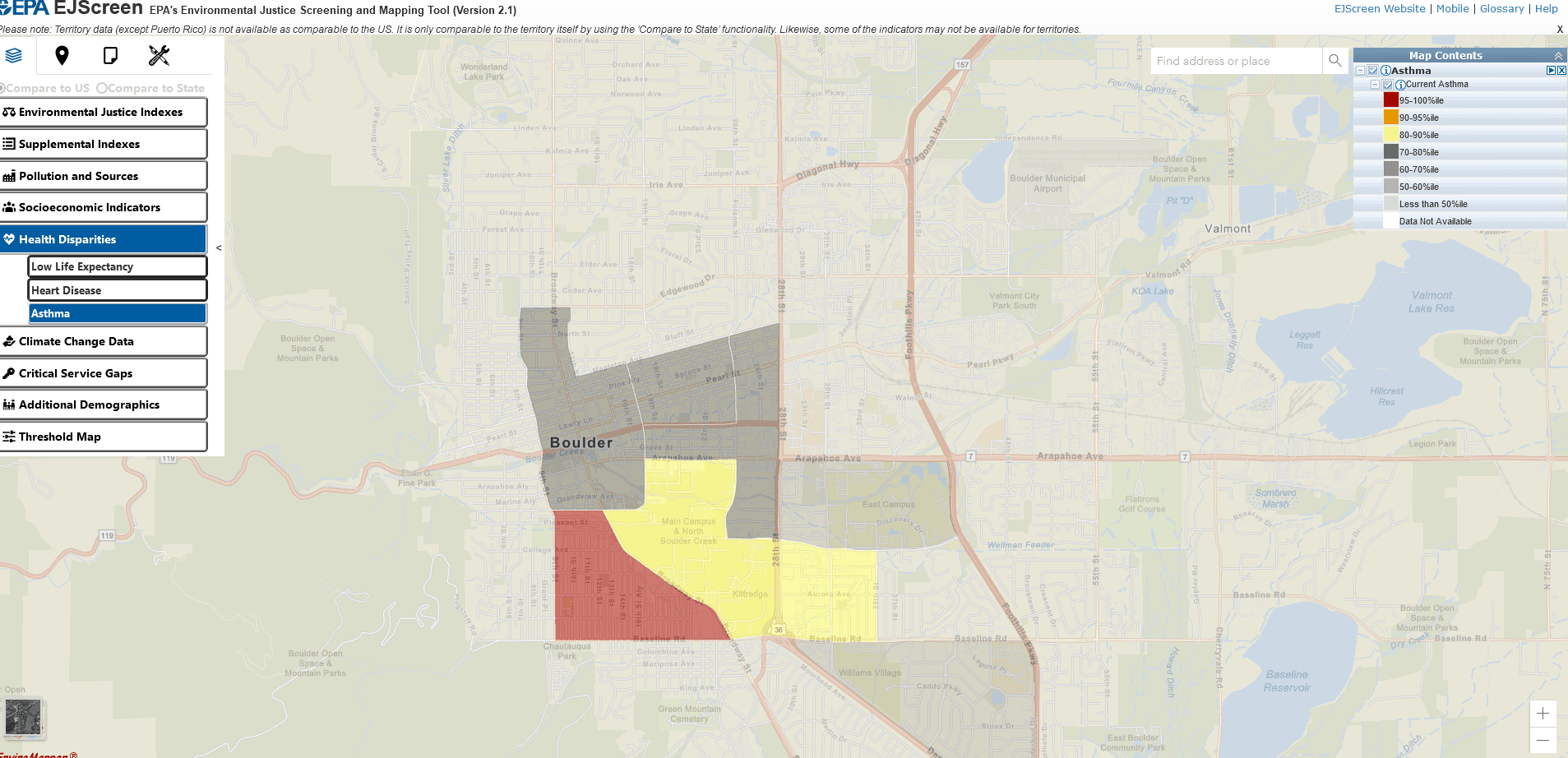
Below are some non-wildfire maps I thought were interesting. Asthma, below.
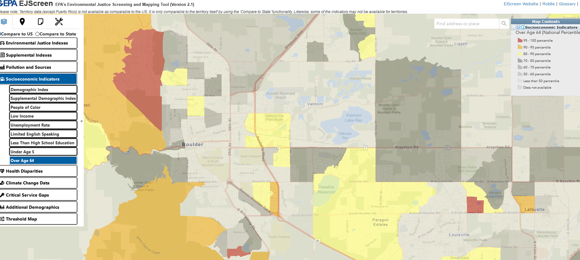
Population over age 64- red is 95-100%. So maybe that actually means 95-100% of the highest number in the US somewhere.. but if so why not use the numbers themselves? Very puzzling.
Since this post, https://forestpolicypub.com/2023/09/18/proposed-ceq-nepa-regs-interpretation-help-requested/, I’ve been wondering what an “environmental justice community” is, and how that might affect public land management. The socio-economic indicators listed for this screening tool are:
– people of color
– low income
– unemployment rate
– limited English speaking
– less than high school eduction
– under age 5
– over age 64
So these seem to be “disadvantages” that might affect an ability to influence government decisions and lead to “underserved communities,” but the mapping tool does not establish thresholds for these that might be relevant for decision-making.
I just ran across another “map” that may be more directly relevant to the question of ‘what is an environmental justice community.’ In a 2022 report on “Progress on Environmental Justice” submitted to congress, the White House appears to define it this way (1 of 3 times):
“During the first half of Fiscal Year (FY) 2022, the U.S. Department of Agriculture’s (USDA) Water and Environmental Program (WEP) has obligated $553 million in assistance to rural environmental justice communities (a mix of rural Alaska Native villages, Tribes, Colonias, and Persistent Poverty Counties)…”
https://www.whitehouse.gov/ceq/news-updates/2022/05/23/biden-harris-administration-outlines-historic-progress-on-environmental-justice-in-report-submitted-to-congress-2/
What are “persistent poverty counties?” Here is the 2023 map: https://en.wikipedia.org/wiki/Persistent_poverty_county#/media/File:US_map._Counties_in_persistent_poverty.png
Most national forests are not near any of these counties, and where they are, in the west they often appear to be near Indian reservations. Outside of the communities specifically identified by the White House, should levels of poverty related to unemployment in rural areas be an “environmental justice” priority for federal land management agencies?